Charts, Graphs & Infographics
The following graphics contain samples charts, icons, and infographics. More and higher quality images and a be implemented by the end of the day. Several options will not be included due to nondisclosure agreements with freelance clients.
Final Board Layouts for Master’s Section Final Presentations
5700 x 5700 px


Throughout the course of the program, student teams of DesignMorphine presented their work on Miro.
DesignMorphine, University of Architecture, Civil Engineering, and Geodesy
Research Cycle
Created in Illustrator
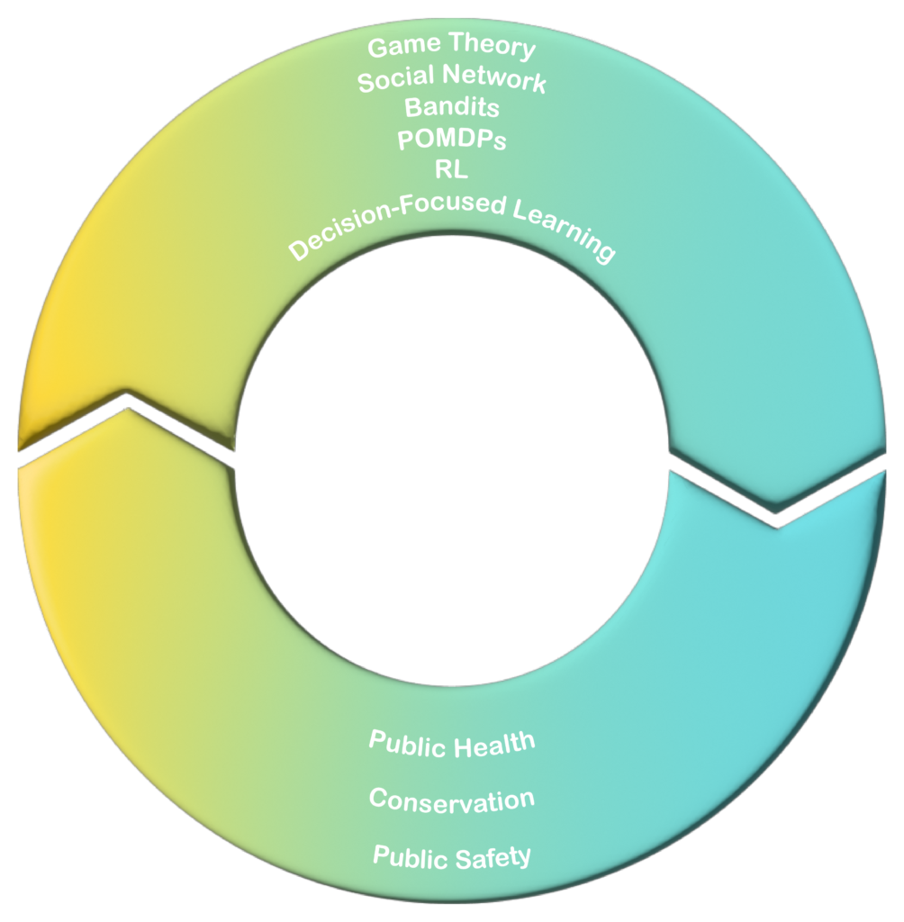
This image recreated an information circuit chart used to explain the dynamics of the research among the different sectors with which the lab collaborated. As the research outreach collaborated with the various groups from the public health, conservation, and public safety networks, the impact fed back into the AI generated research cycle, augmenting the next cycle of research expedited.
Harvard University
CATEGORIZATION Chart
Print Media
2.5 x 2.5 inches
Created in Adobe Illustrator
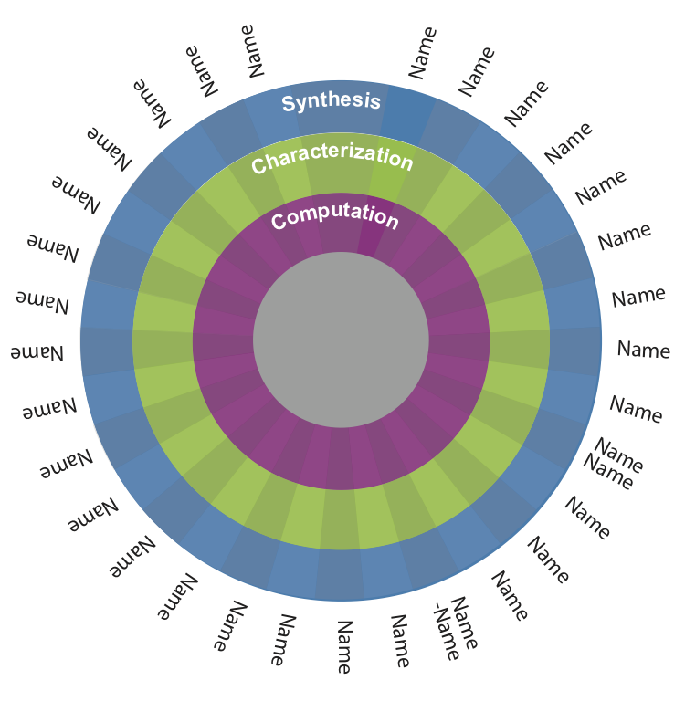
This chart illustrates the names of faculty and their areas of expertise in an interdisciplinary $25M proposal to the National Science Foundation in 2019. Each ring of color demonstrates the faculty focus area checked or unmarked do indicate faculty’s names checked. The actual names and expertise of the faculty involved in this project were removed and replaced with the inserted “Name” as a placeholder for the sake of confidentiality.
Massachusetts Institute of Technology
TEN YEAR TIMELINE
Chart
2.75 x 2.25 inches
Created in Adobe Illustrator
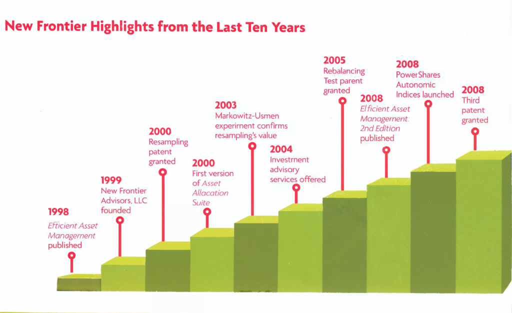
This chart illustrates the progression through ten years of successful milestones leading up to the anniversary of the financial firm, New Frontier, which became a decade old.
New Frontier
ICONS
Created in Illustrator
1 to .5 inch
Size varied upon use within text.
The logos an icons on this page include images created for various projects at MIT, including the and the Laboratory and Library for Engineering and Analytics of Polymers (LEAP) innovation.
The LEAP project contributed to a proposal to the National Science Foundation (NSF) for a $25M grant to execute a new innovation to polymers research. The graphics and icons for this project utilized a color pallet selected by the principal investigator of the project to visually indicate subject components applicable to each topic throughout the proposal.
Massachusetts Institute
of Technology
INSTRUCTIONAL FLOW CHART
Digital + Print
Created in Illustrator
5700 x 17,000 px (print)
This flow chart illustrated the process for booking usage in the MIT Shared Facilities labs. This interactive tool implemented anchor points online and was viewed in sections per anchor. Larger printed versions hung outside of the relevant labs.
Massachusetts Institute of Technology